What is SALT?
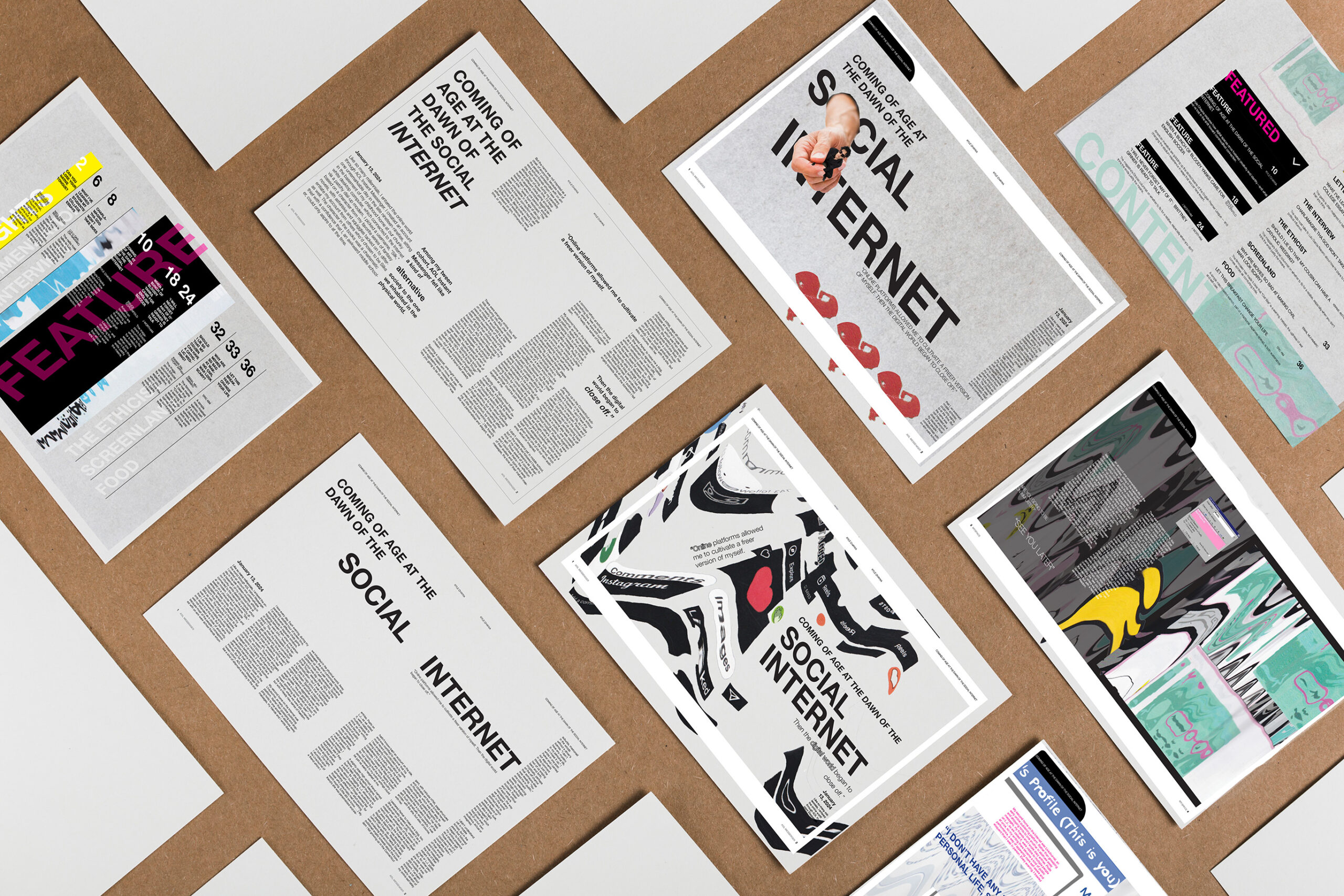
SALT is creative magazine focused on commentary on awareness of the effects of social media, specifically how its social and psychological affects from the access it gives. The magazine includes callouts highlighting terms that were brought up during the rising of social media on the internet, using terms that are still used today. My intent with both my choices in imagery and quotes were to help the younger audiences connect with the article via seeing things they are familiar with, such as common social media pages and logos.
Process

Starting off, as we chose our article to design about, we analyzed the copy and explored different formats and layouts for spreads.
Next, we explored highlighting text for callouts and image-making. Around this time, I explored the idea of scanning images, making a collage style from stock images relating to the internet. I tried to explore all aspects I could think of: microinteractions like liking or commenting, recording oneself, and some overall type of distortion of the word SALT. In the end, I resonated with my exploration of the opening spread the most.
I decided that I would continue with a distorted-like pattern for the rest of the theme. The issue before was gathering relevant collaging images good enough for a background, but with this new approach, I could experiment more on a common, central theme. Since the article was about different social medias throughout the author’s years, I distorted those social media pages to adhere to the theme and also provide visual context to the reader.
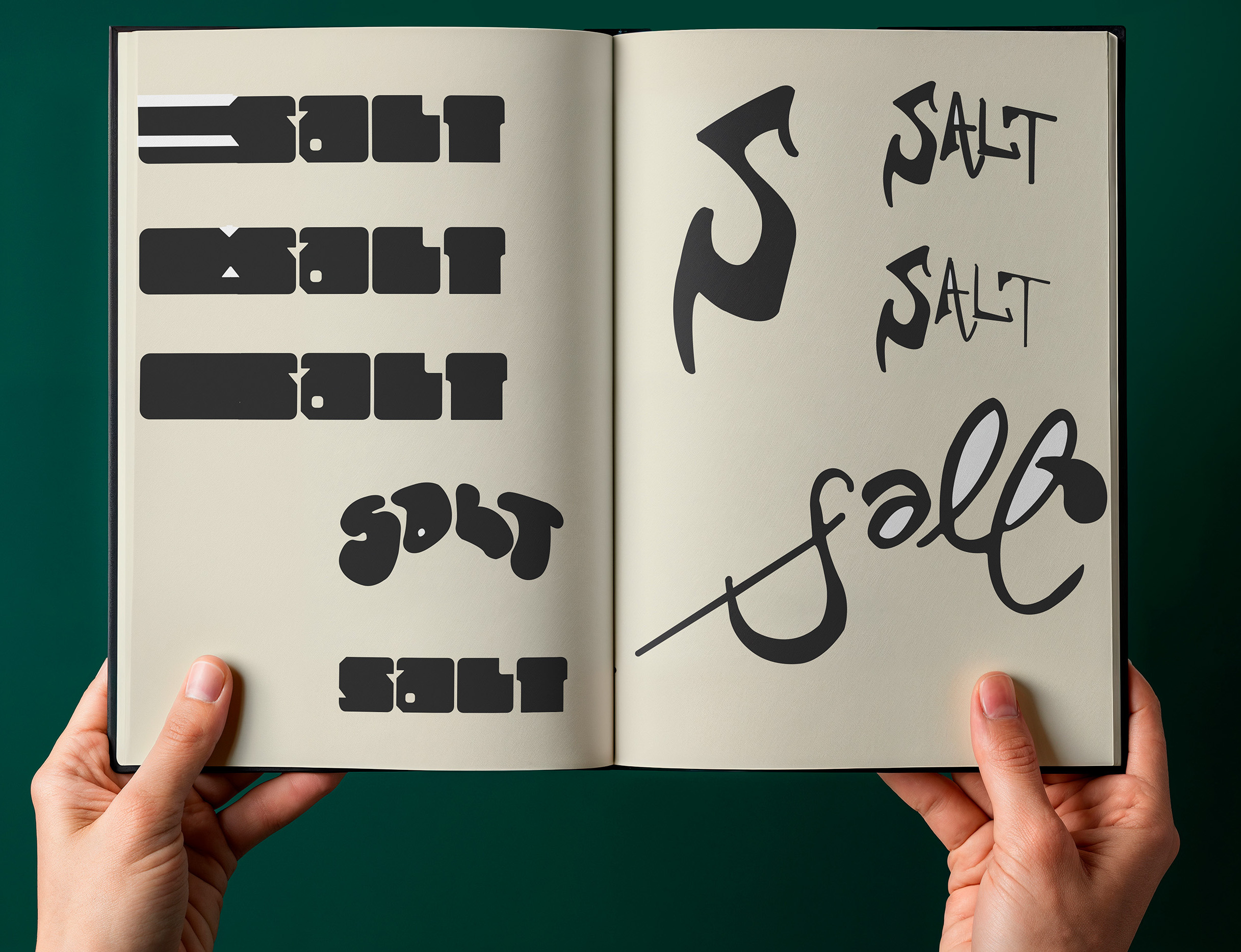
As we continued working on the spreads, we started developing our mastheads. We worked through sketches, digitizing sketches, and layouts for an overall cover.

Animation
Since this issue is based on the Internet, I wanted to reflect on that through animating the issue boxes as old-fashioned pop-up ads.
